Many sources of truth, one screen.
A public-facing climate and environmental data platform that aggregates ground sensors, hyperspectral satellite imagery, and federal public APIs into something a planner can read — without first becoming a scientist.
- Year ·
- 2022 – 2023
- Role ·
- Tech lead, via Lofty Labs
- Outcome ·
- Inflected the company's commercial trajectory
Sources of truth, unified
Layer 01
Hyperspectral imagery
Planet Labs, Sentinel-2
Layer 02
Ground sensor mesh
Air, water, soil moisture, weather
Layer 03
Air quality APIs
PurpleAir, OpenAQ
Layer 04
Federal datasets
USGS, NOAA, EPA
Layer 05
Local context
Land use, parcels, infrastructure
The situation
The data exists. That's the strange part of climate and environmental work right now — the raw material is plentiful and mostly public. Air-quality sensors blanket cities, satellite constellations revisit every patch of ground every few days, federal agencies publish high-resolution time series of nearly everything you'd want to track. The bottleneck isn't measurement.
The bottleneck is that no one has the time, the data engineering capacity, and the visualization chops to assemble it into a picture an actual decision-maker can use. The client wanted to be the company that did.
What I built
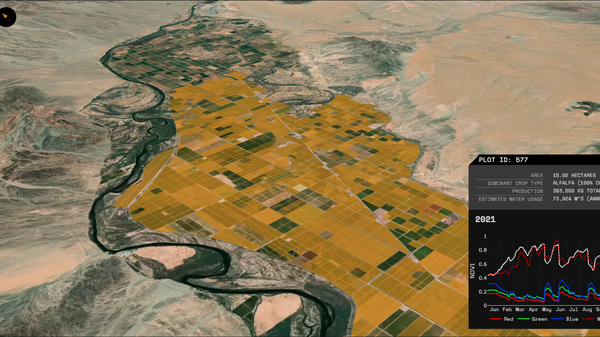
I led the engagement as tech lead through Lofty Labs. The platform pulls hyperspectral imagery from Planet Labs and Sentinel-2, telemetry from a mesh of ground sensors, and time series from PurpleAir, OpenAQ, USGS and NOAA, and unifies them on a Postgres / TimescaleDB / PostGIS backbone. The application surface is a Vue.js single-page app with D3 visualizations against a Django GraphQL API.
What mattered most wasn't the pipeline. It was the visual layer. A scientist will read a Jupyter notebook. A planner, a community organizer, a city councillor will not. The hard product work was deciding what to show, what to hide, how to make a multi-source, multi-resolution, multi-cadence dataset legible at a glance — and trustworthy enough to base a decision on. That's where the engagement spent its design budget.
What changed
The platform inflected the company's commercial trajectory. Instead of pitching expert services that delivered a custom report per engagement, they had a shipping product that the same kinds of buyers could pick up and use directly — and which scaled the way services never could.
The hardest part of a data product usually isn't the pipeline. It's the screen at the end of it. If you're staring at that screen and it isn't quite right, get in touch.
Start a conversation →